The demand for graphic designers has never gone down over the past few years. They’re always needed for freelance projects as well as the regular 9-5 graphic design jobs. Everyone loves to have attractive designs and images for their websites. Companies and individual professionals can attract potential customers with such elements on their sites.
The good old cliche ‘pictures speak a thousand words’ is quite true even today. Graphic designers have a good knowledge about creating thought-provoking and relevant images. The ones who are experts in the field can get it done within a few hours. New designers usually follow the latest trends to get that initial breakthrough.
While some trends are extremely good, others are not so interesting. Given the number of choices, new designers must use their wisdom and avoid the disastrous trends. Here are a few graphic design elements that they must avoid:
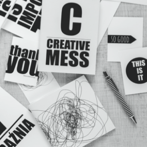
1. Bold typography
One of the integral parts of graphic design is typography. It plays an important role in improving readability and optimizing images and texts. Today, typography is pretty much in vogue. A simple line can be turned into a strong statement by its usage. It can also help a brand convey its message and make an impact on the audience.
Bold typography is often used for taglines and slogans as it makes texts appear perceptible. However, it has several drawbacks as well. Among them is the fact that it is tough to comprehend. So, it would be quite difficult to retain the attention of the audience for a long time.
2. Asymmetrical layouts
New designers think that asymmetrical layouts can break the order and enhance graphics in a big way. Some of them are of the opinion that asymmetry would help in creating a sense of awe. This is not always true, as asymmetrical images may ruin the main purpose of the design.
Critical information may get lost, as the website users may not spend hours to find a particular text. They would search the text at the same spot where it was earlier.
3. Bold color theme
There was a time when natural and soft color themes were extensively used in graphic design. Today, this trend has changed. In recent times, bright and bold colors are used to a great extent. They instantly catch the attention of the audience and make a website stand out from the rest.
Essential sections of a blog or a website can also be highlighted easily with the use of bold color themes. This logic is not at all faulty, but bright colors are a bit harsh on the eyes. Human eyes can’t normally look at bright colors created by software for a longer duration.
4. Stock photography
In order to transform the dull appearance of a website, new designers often use shortcuts. To improve the visual appeal of the site, they use stock photos. This trend has now become redundant and outdated. If they wish to create a powerful experience visually, they must use original photographs. They can also use a variety of tools or software to create powerful images.
It doesn’t come as a surprise when people are ready to pay for unique, thought-provoking, interesting, and original photographs. Stock photos can be edited and used by utilizing the powerful features of certain online and offline tools.